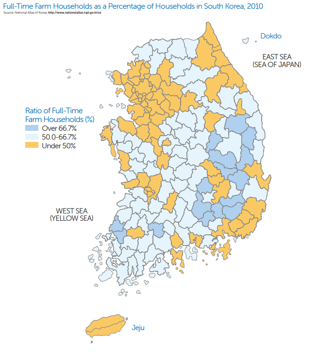
1. Which of the following statements is true about the map shown?
- a. The map shows the features of the land’s surface, which is key information for full-time farming households.
- b. The map uses lines to join points of equal value in order to show areas with similar percentages of full-time farm households.
- c. The map uses different colors and shades of those colors to show the ratio of full-time farm households in each county.
- d. The map shown shows different landmarks and information about South Korea, which helps to explain why full-time farm households are more prevalent in some counties.
- e. The map shown indicates the annual agricultural output of full-time farm households in South Korean counties.
b. This is WRONG because an isoline map would be used and the map shown is not an isoline map, the lines of the map represent different internal divisions and not connected values.
c. This is CORRECT because a choropleth map uses tones or colors to represent spatial data as average values per unit of data. This choropleth map shows the ratio of full-time farm households as a percentage of population per county.
d. This is WRONG because this is not a reference map and the map does not show information about South Korea that would explain the patterns shown. Although the seas are labeled this information does not correlate with the patterns on the map.
e. This is WRONG because the map does not display any information that indicates the output of the counties. While it may be the case that counties with higher percentages of full-time farm households have greater agricultural output, other factors such as farming techniques impact production.
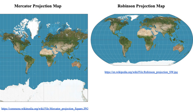
2. Which of the following statements about these two maps is accurate?
- a. Robinson projection maps provide better information for navigational purposes than Mercator projection maps.
- b. Robinson projection maps provide more accurate representations of population density than Mercator projection maps.
- c. Robinson projection maps provide better topographical information than Mercator project maps.
- d. Robinson projection maps provide less distortion of country sizes at high latitudes than Mercator projection maps.
- e. Robinson projection maps are better suited for addressing territorial disputes between countries than Mercator projection maps.
b. This is WRONG because both maps would provide equally accurate representations of population density since population density utilizes thematic maps and remains unchanged regardless of projection type.
c. This is WRONG because both maps could provide equally accurate representations of topographical information if such information were included.
d. This is CORRECT because Mercator maps lack any curvature nearing the poles and therefore represent those areas as significantly larger than their actual size. Robinson maps, due to their curvature nearing the poles, represent the relative sizes of high latitude regions more accurately.
e. This is WRONG because neither map would provide additional information that would be better suited to address territorial disputes.
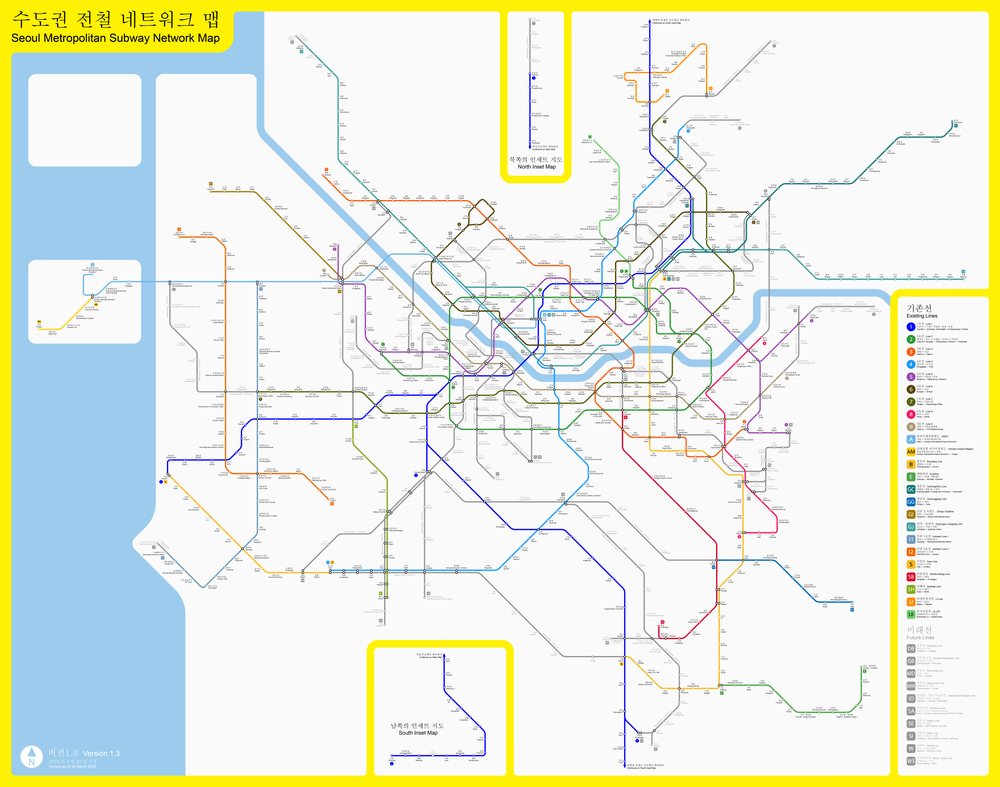
3. Which term best describes a suburban area outside of Seoul, South Korea where many people commute into the city of Seoul?
- a. Formal Region
- b. Informal Region
- c. Functional Region
- d. Perceptual Region
- e. Conformal Region
b. This is WRONG because an informal region is not an actual type of classified region.
c. This is CORRECT because a functional region is an area centered on a node, focal point, or central hub surrounded by interconnecting linkages. For this question the suburban area is organized around the central city of Seoul, South Korea, where people commute in and out of the city.
d. This is WRONG because a perceptual (or vernacular) region is defined by how a person or people view a region based on a variety of factors. The information displayed does not address how people within and/or outside the information are perceived.
e. This is WRONG because a conformal region is not an actual type of classified region.
Answer questions 4 and 5 based on a comparison of the two maps below:
MAP A: Percentage of Hispanic or Latino Population in the United States, 2020
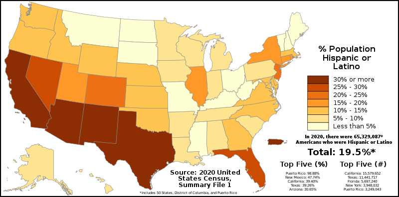
MAP B: Mexican-American Population Percentage By County in the United States in 2000
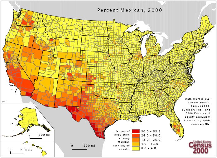
4. Which of the following scales of analysis is represented in MAP B?
- a. Global
- b. International
- c. Continental
- d. National
- e. Local
b. This is WRONG because an international scale of analysis would show data grouped by multiple countries.
c. This is WRONG because a continental scale of analysis would show data grouped by continents (e.g. Africa, Asia).
d. This is WRONG because a national scale of analysis would show data grouped by nation (country) whereas this map, while it shows the United States, breaks data into more localized units.
e. This is CORRECT because the map breaks data into subnational (local) units to enable analysis of patterns within each state and across the country.
5. Considering both maps, which of the following would be considered a limitation of MAP A in showing the Hispanic population percentages in the United States?
- a. States with larger populations do not accurately reflect the Hispanic populations in those states.
- b. States with smaller populations do not accurately reflect the Hispanic populations in those states.
- c. The scale of analysis for states in the Northwest fails to address that there are some urban areas that have a much higher percentage of Hispanics.
- d. States in the Southwest underrepresent the number of Hispanics due to their historical connections to Spain.
- e. The information in Map A is likely to be inaccurate due to the large size of the United States.
b. This is WRONG because there is little Hispanic population in many of the least populated states.
c. This is CORRECT because some of the urban counties in the Northwest have concentrations of Hispanics that are not reflected due to the scale of analysis of Map A, as evident in Map B.
d. This is WRONG because historical connections have nothing to do with how map data is represented and large numbers of Hispanics are shown in the Southwest.
e. This is WRONG because the data is broken down at the subnational level for the United States and therefore the country is not being grouped together as one unit for data analysis.
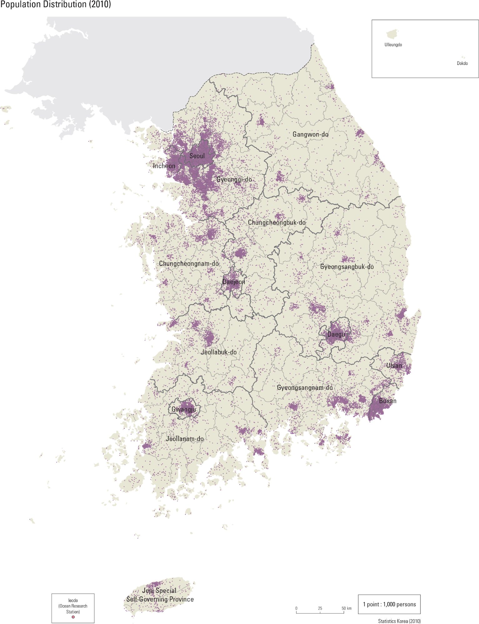
6. Which of the following patterns is evident on the map of population density?
- a. The population density of the Northwest is less than the Northeast.
- b. The population density remains constant throughout South Korea.
- c. The population is clustered along coastal areas.
- d. The population has several clusters, but the main population cluster is in and around Seoul.
- e. The population density is unclear due to the data being presented at the national scale of analysis.
b. This is WRONG because the population density has multiple significant clusters.
c. This is WRONG because the population is clustered along some non coastal areas along with coastal areas.
d. This is CORRECT because the main population cluster is in and around Seoul. The cluster in and around Seoul is the largest cluster shown on the map.
e. This is WRONG because the scale of analysis is at the subnational scale and patterns within South Korea are evident.
Answer question 7 based on the graph and map shown below:
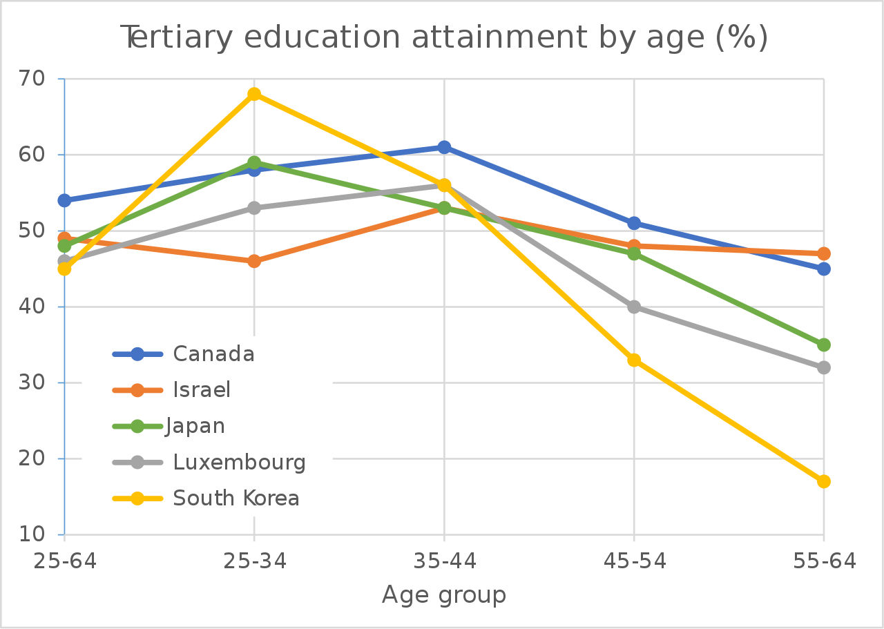
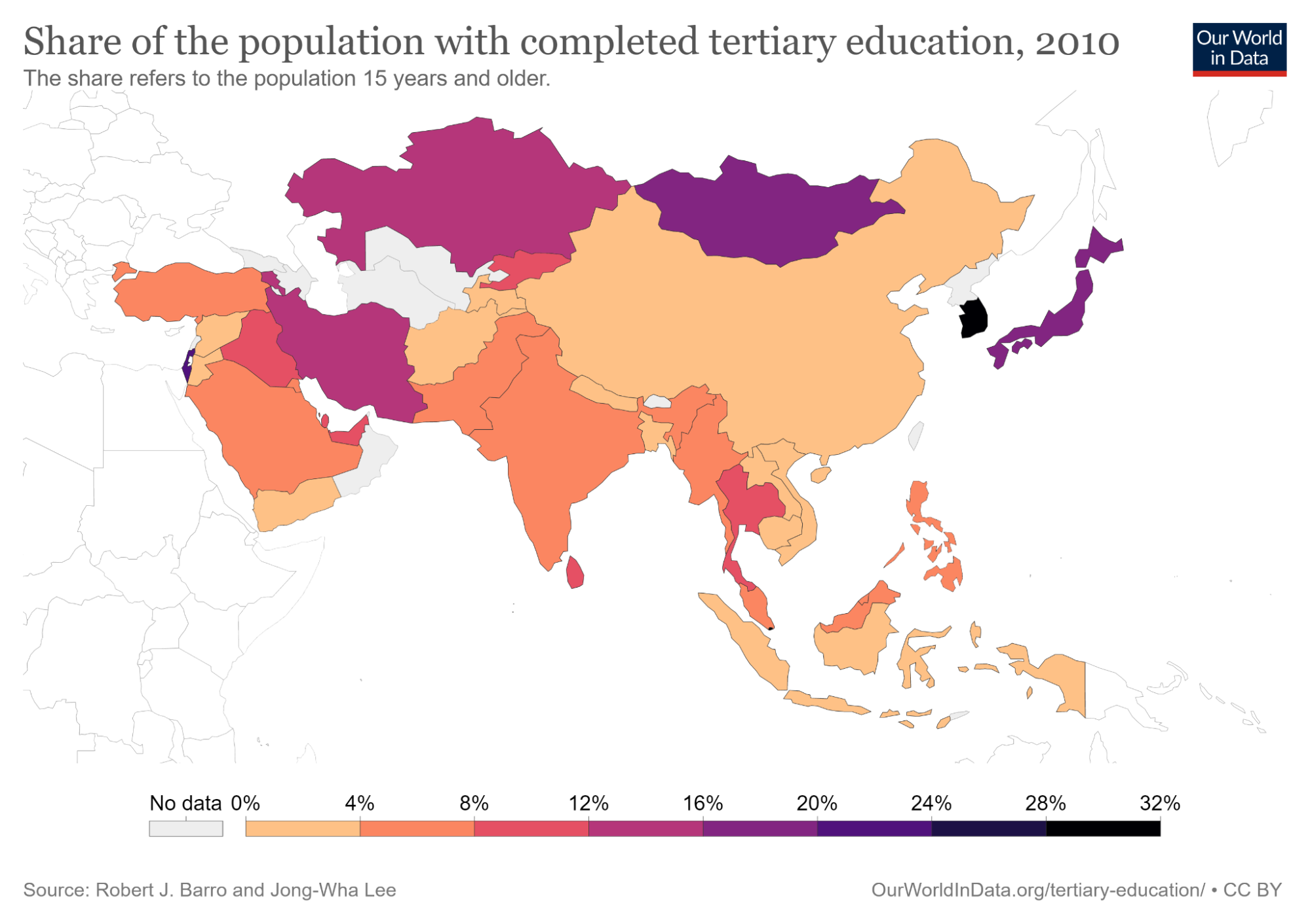
Tertiary education refers to all formal post-secondary (beyond high school) education, including universities, colleges, technical training schools and institutes, and vocational schools.
7. What best explains South Korea’s ranking as the country with the highest tertiary education levels in Asia in 2010, despite having the lowest percentage of tertiary education attainment for adults over the age of 38 years-old?
- a. South Koreans over the age of 55 viewed education as unimportant.
- b. South Korea developed more opportunities for tertiary education in the last 35 years.
- c. Prior to 1990, South Korea had no tertiary education available to its citizens.
- d. Other countries have seen a rapid decline in tertiary education as South Korea as started to see more emphasis on tertiary education.
- e. Beginning in the 1950s, South Korea required all citizens to participate in earning tertiary degrees.
b. This is CORRECT because South Korea has developed rapidly and with rapid economic development has come more educational opportunities.
c. This is WRONG because some citizens were still acquiring tertiary education, it was just less prevalent than today.
d. This is WRONG because the chart shows that while some countries have not experienced the large percentage increase South Korea has experienced, there have not been rapid declines in percentage of tertiary education.
e. This is WRONG because not only did South Korea not have this policy, the percentages of those earning tertiary degrees would then be even greater since it is still not close to 100%.